Kalimba België branding and website
Kalimba has been successful since 1996 in supplying quality water to companies, institutions, and individuals. Kalimba extracts high-quality water from Limburg soil with the greatest care. Won with attention to people, nature, and the environment, carefully bottled and presented in an honest way, delivered in a water cooler. Branding agency Stoere Binken Design designs the rebranding and develops the entire new brand identity and bespoke website.
Stoere Binken Design wins the Euregional pitch from Kalimba
Ab van Deemter – an honest, well-behaved Amsterdammer – and Managing Director of Kalimba approached us with the question of whether we could improve Kalimba’s brand positioning. Totally our thing!
After a pitch among 3 creative agencies from the Euregio, Kalimba has chosen Stoere Binken Design to be their new creative agency.
Redesign of the Kalimba logo
First, we carefully analyzed Kalimba and the market and concluded that a repositioning, while retaining existing corporate identity elements, is not sufficient. That is why we took the bold step and immediately presented a full logo redesign at the first presentation. A strategy that proved successful. This was really the first time that we got applause at our presentation! The greatest honor for us as designers.
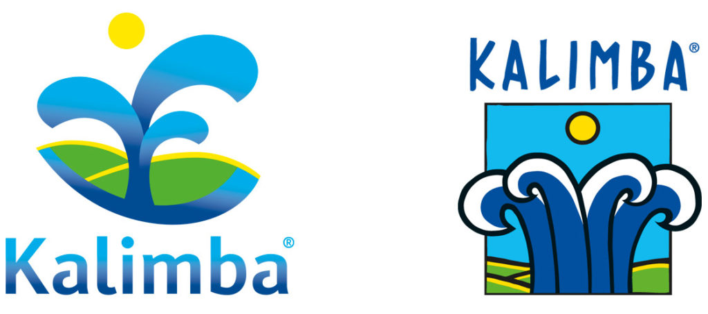
On the left, you see the new logo that Stoere Binken Design designed for Kalimba. On the right the 15-year-old logo, clearly in need of refreshment.
We found that Kalimba’s storytelling and brand values did not show up well in the old logo. We wanted to honor the built-up brand reputation as much as possible. That is why we reused some elements of the old logo in our cool new logo. This ensures that the target group does not become estranged from Kalimba, but feels comfortable with the new identity.
In our new logo, we used not 4 but 3 water jets. They symbolize the 3 European countries in which Kalimba is active; Belgium, the Netherlands, and Germany. The water jets shoot up from the ground, the Limburg landscape. This visualizes Kalimba’s own water well, which is actually located in Limburg, and from which they bottle their water.
Logos
A serious rebranding requires sustainable market research
The working area of Kalimba covers 3 European countries: the Netherlands, Belgium, and Germany. This contains the challenge that we had to solve at Stoere Binken Design. How do we get all this in one line?
Maastricht University has, therefore, conducted telephone research in 3 countries to find out how individuals and companies deal with the purchase and use of a water cooler. You surely understand that this resulted in 3 different answers.
Do you want to know more about the results of this study? Feel free to contact us.
Kalimba water with Limburgish character
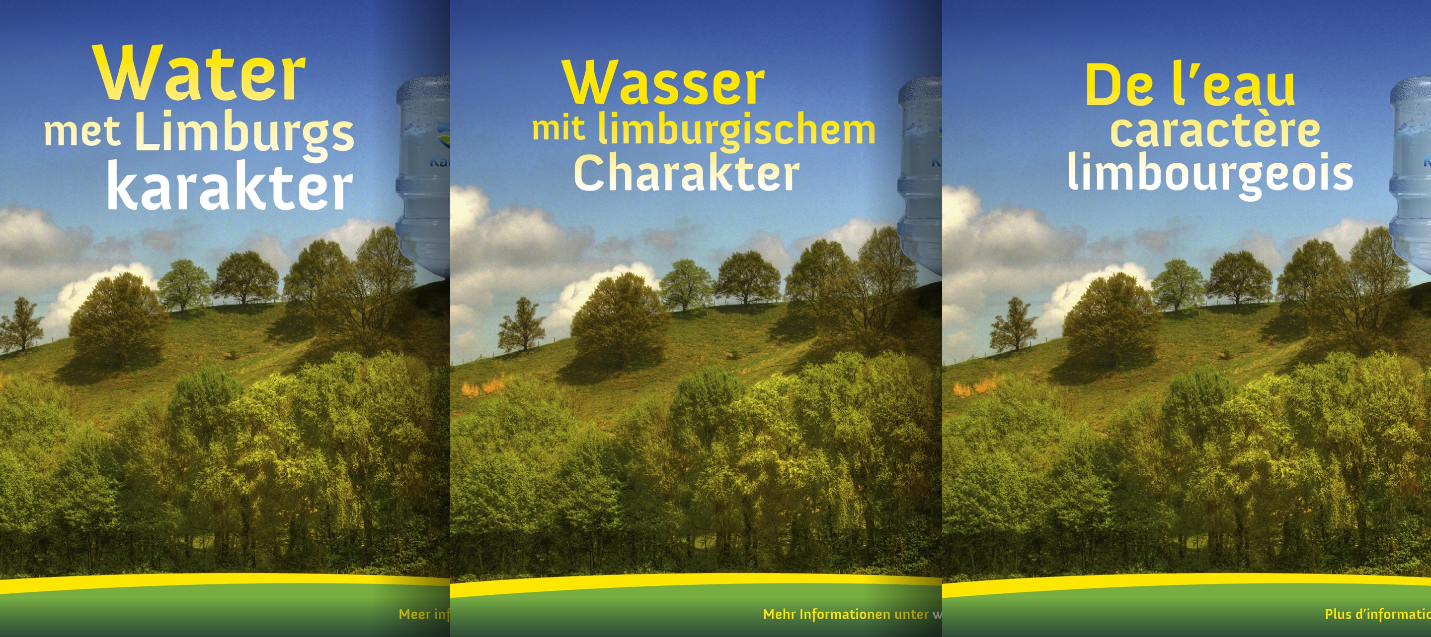
It was a real challenge to come up with a uniform brand positioning and advertising campaign for 3 different nationalities. We used all the results of the market investigation and summarized them under the most important common element; Limburg.
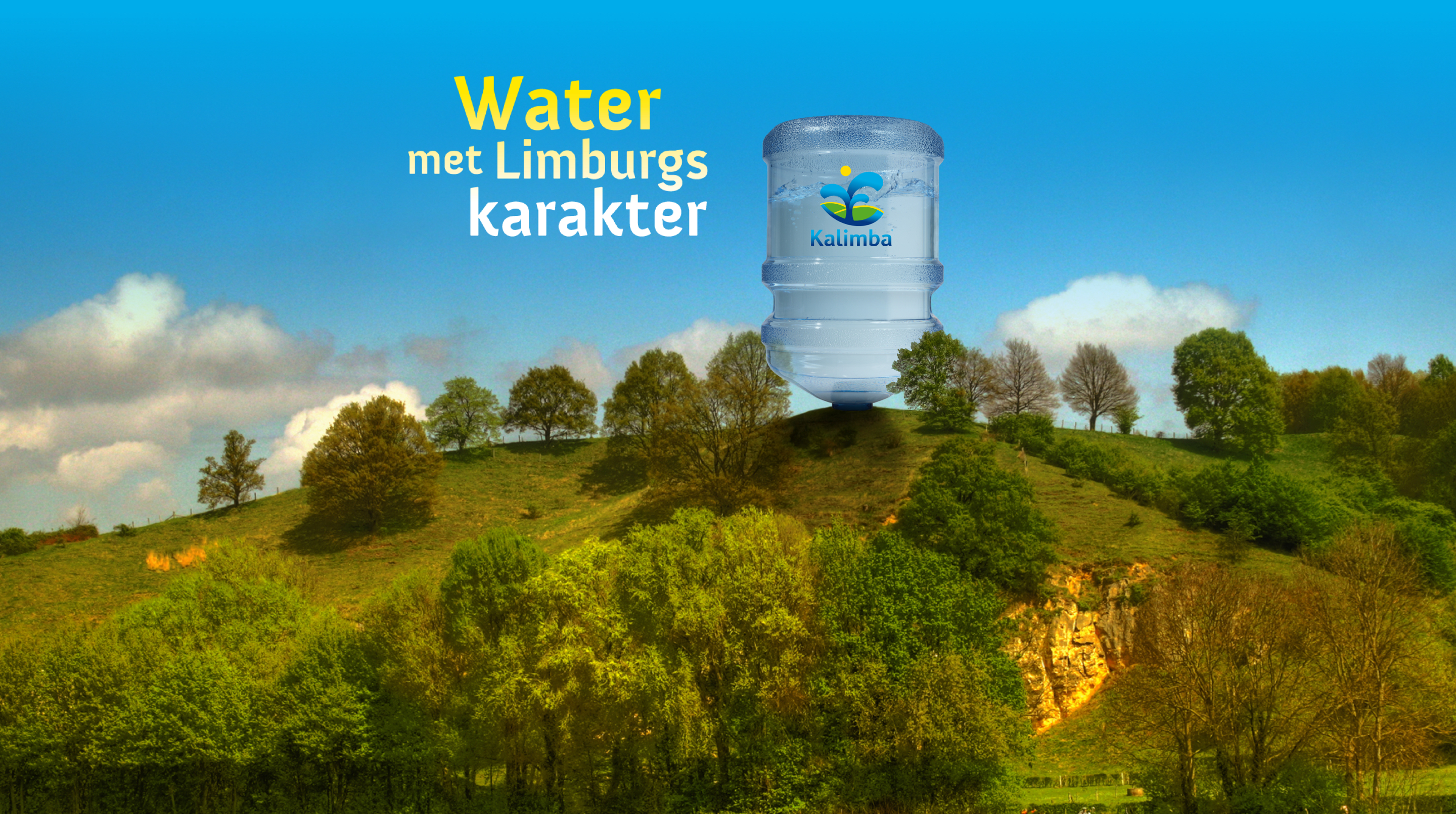
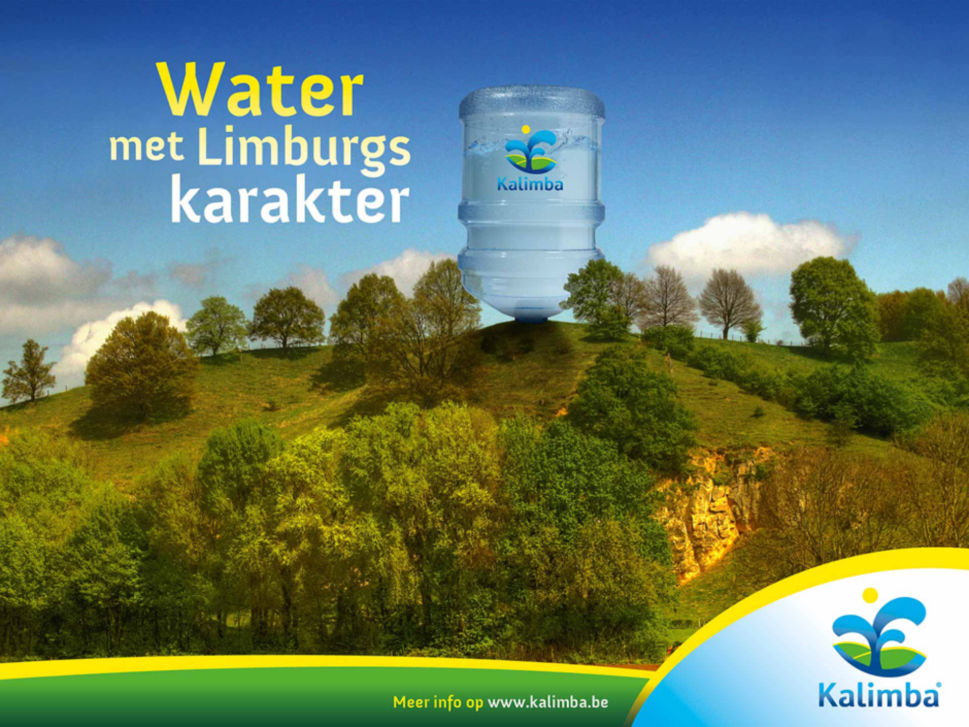
All 3 EU countries have their own Limburg area. These areas border one other and Kalimba is located in the center. Since the water is drawn from their own well, we have come up with a new corporate slogan; “Water with a Limburg character”.
Cross-border Limburg landscape
The new campaign image is striking, strong, and extremely distinctive in the market. No competitor does something similar. The Kalimba water bottle on top of the Limburg hill is a genius find, because no competitor has such a brand identity. Kalimba is unique, surprising and refreshing.
Stoere Binken Design always develops unique identities, because no customer, market, and target group are the same.
Kalimba landscape
All the photos we used on the website are real Limburg landscapes; undulating, natural and challenging. Each landing page on the website has its own suitable photo to show the diversity of the Limburg landscape.
The photo of the Limburg landscape that we used as a campaign image was shot by Pascal Lemlijn Photography.
Storytelling
The result is amazing
After 15 years we were in need of renewing our brand appearance and wanted to remind the world of our existence in an original way. To give substance to this, we invited three advertising and design agencies. Stoere Binken Design was selected by us for their appealing name and it were ultimately the Binken who convinced us during the presentation of their ideas with the most creativity, flexibility, thinking ability and a sense of reality. This ultimately led to the fact that we trusted the complete rebranding and repositioning of the marketing and communication in their hands.
The result is amazing and that what is to come raises high expectations. The compliments from our customers and prospects are therefore overwhelming. We sincerely hope that our collaboration with Stoere Binken Design lasts forever.
Managing Director
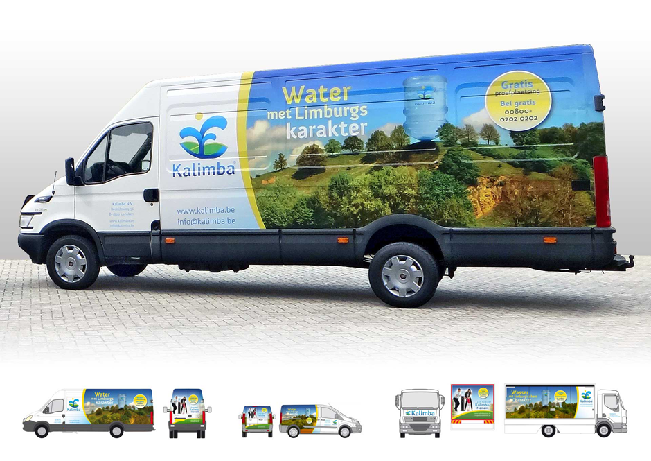
Fleet with a Limburgish character
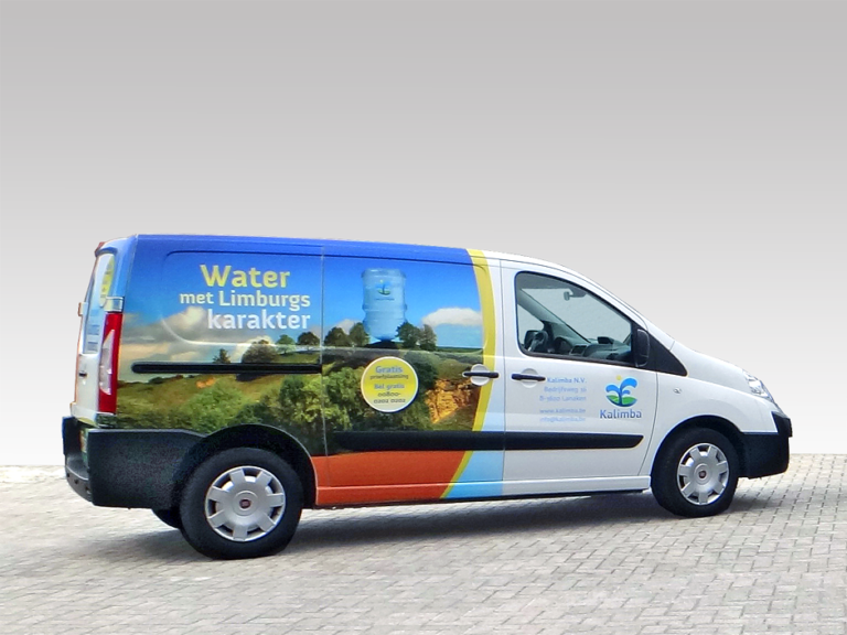
The Kalimba fleet can be seen on the road throughout Limburg every single day. The most service-oriented Kalimba employees are behind the wheel. They bring and collect the Kalimba water and transport it throughout Limburg, in three countries.
We believe that the Kalimba vehicles are one of the most visible and tangible brand assets. That is why the marketing campaign image is shown as large as possible on the side. They are mobile advertising columns that you cannot ignore.
Our design for the Kalimba vehicles is set up in such a way that it is scalable. From the small Peugeot combi to the Mercedes Sprinter and truck. The Kalimba campaign image can be implemented consistently throughout the complete brand design.
Fleet
Corporate identity font with character
Kalimba’s corporate brand font is the CFF Insider Pro, designed by René Verkaart, aka Characters Font Foundry. The round shapes perfectly match the warm character of the new Kalimba logo.
Fonts are extremely important for brand identities. It visualizes the DNA of your company in the purest form. Custom fonts are the future for SMEs.
Custom type

Are you looking for a brand design with character?
Branding agency Stoere Binken Design specializes in unique brand identities. The identity and custom website that we design must make your company successful. Make an appointment without obligation to discuss the possibilities together.
