Keerpunt book
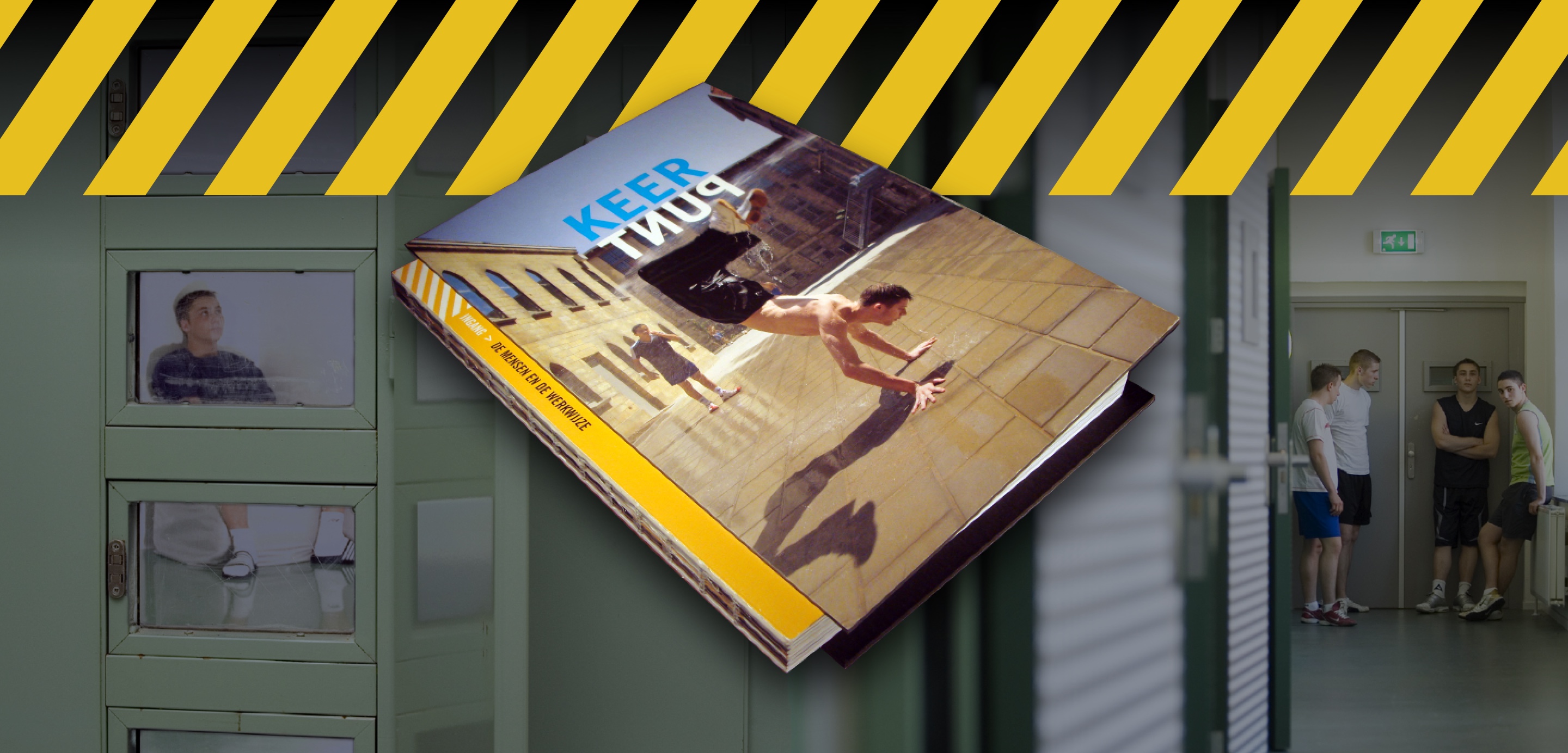
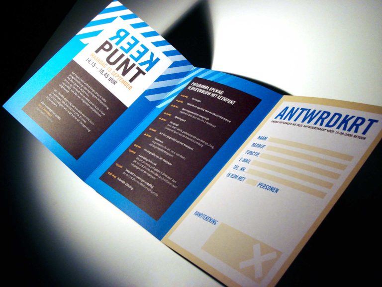
Keerpunt is one of the fourteen Dutch juvenile justice institutions for teenagers from twelve to eighteen years old. It has an imprisonment and treatment department. The treatment department has closed and half-open facilities. Graphic design agency Stoere Binken Design Limburg creates the book that was published to document and celebrate the capacity expansion, renovation, and the official re-use.

Keerpunt: boarding school since 1911
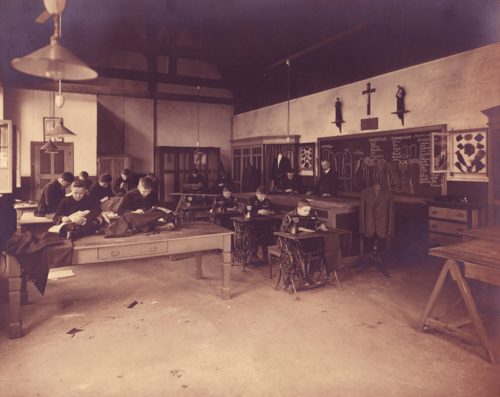
The origin of the former “Huize St. Joseph” dates from the beginning of the last century, from May 18, 1911, to be precise. A building with the aim of ‘caring for abandoned, needy or neglected, male persons of all ages, in particular, the sustainable care of minors in or out of institutions’.
Keerpunt was founded in 1984 as part of the Stichting Jeugdzorg St. Joseph. It is now a private youth institution for care and treatment.
Storytelling
1 book, 2 entrances to Het Keerpunt
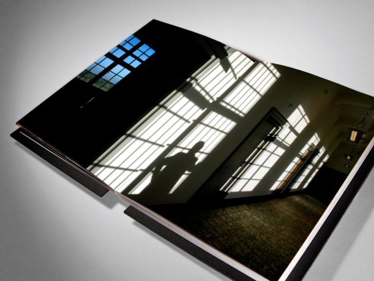
Judicial youth institution Keerpunt is a prison. Young people are locked up here and we want to capture that oppressive feeling with our design of the book. Two hearts beat in its chest:
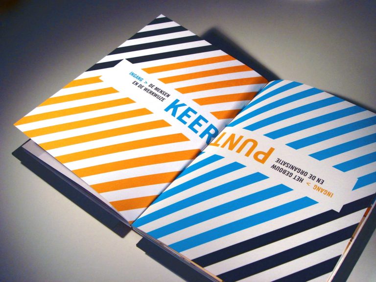
- People: residents and the work method
- Building: renovation and the organization
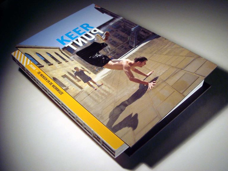
We have designed the book in such a way that it literally has two entrances from which you can start to read. You must flip it over to be able to read both storylines. This is the core of our concept and also a metaphor for ‘the turning point’ (in Dutch; Het Keerpunt) in the lives of young people.
2 types of paper
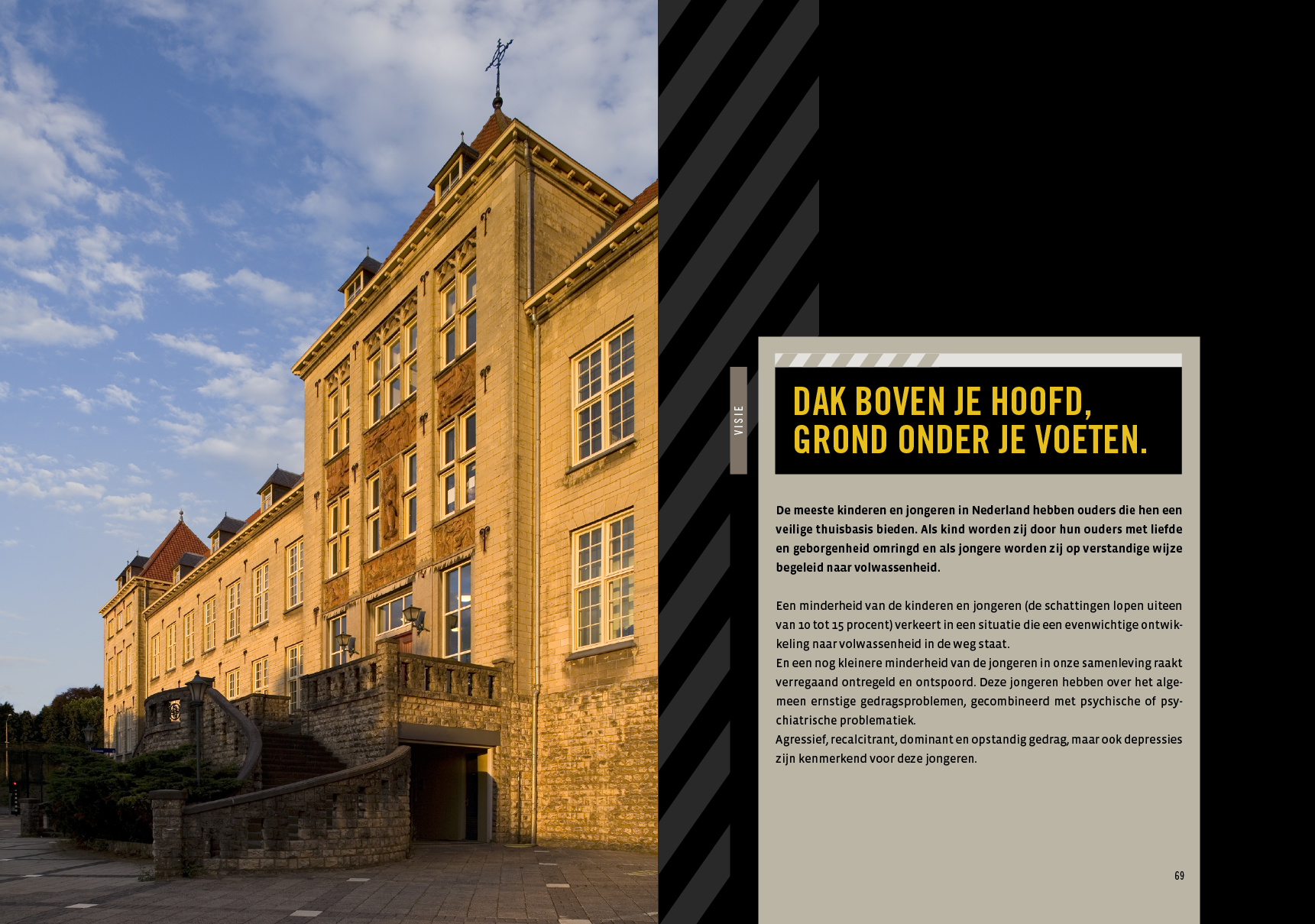
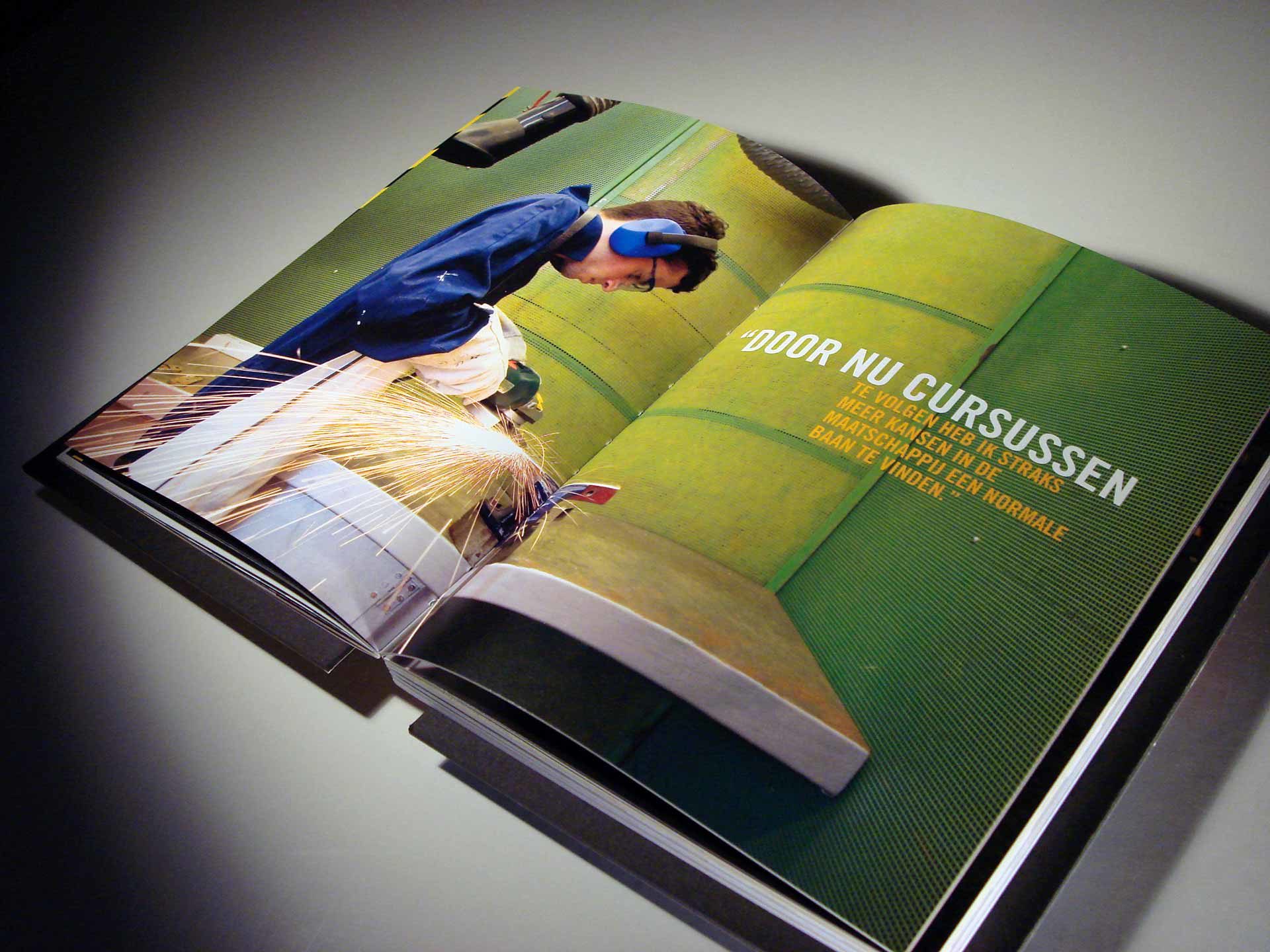
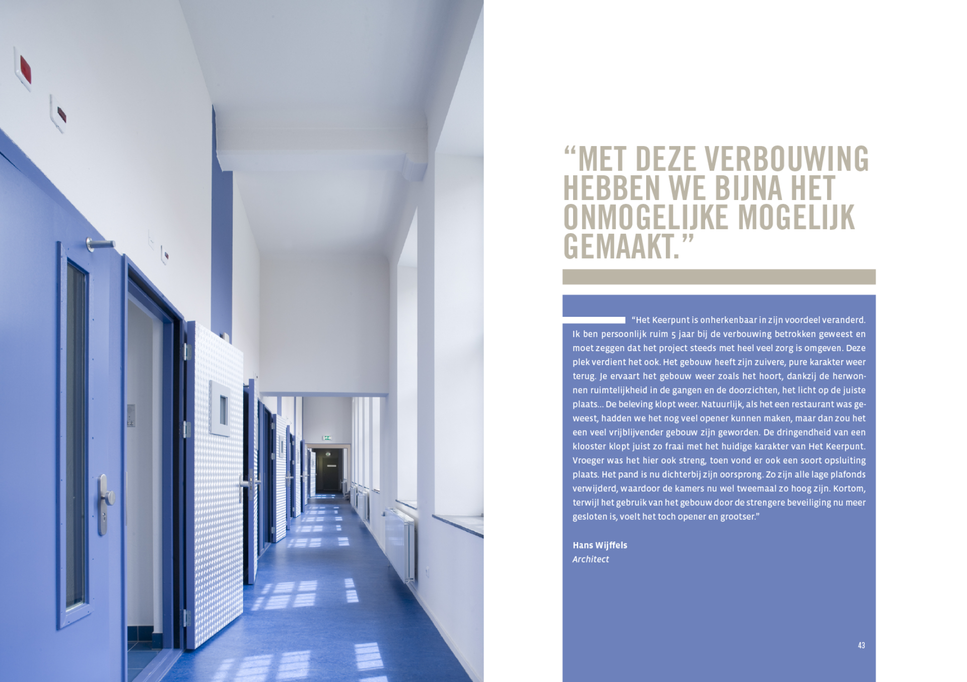
Both book sides are printed on different types of paper to underline the feeling they portray. The “building” is printed on uncoated paper, which gives it a rougher and dustier character. The “people” are printed on smooth paper to give it more contrast and detail. This clearly visualizes the Storytelling concept that we devised for the Keerpunt book.
More books
Hardcover with an open spine
Normally the book folio is bound in a cover with a hardback. That usually contains the title and author of the book.
We have deliberately omitted the hardback to provide direct insight into the heart of the book. The colors, the paper, the twine. Everything is visible to give the book a fragile touch. We used black cardboard plates as a cover to give it a hard and cold look.
Stoere Binken Design transcends the ordinary
With its idiosyncratic, unconventional creative drive, Stoere Binken Design transcends the ordinary. Because boring is always possible.
General Director

Respect for privacy
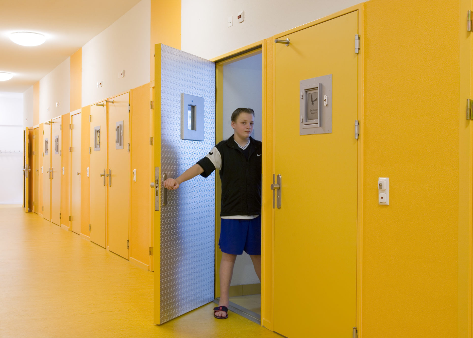
The briefing stated that for privacy reasons the teenagers were not allowed to be portrayed recognizable. Photographer Philip Driessen, responsible for the photos of the young prisoners, shot a test series that we could present to the client. Stubborn as he is, he has photographed the teenagers in a recognizable way, but with respect to the dramatic story behind these young offenders. The photos have been received so well that Het Keerpunt asked all the teens and their parents for written permission to use their photos. And with great success, because this ultimately gives the book a much more personal, open and, above all, positive appearance.
Photography
Unique storage box
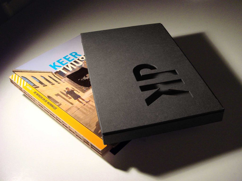
As icing on the cake, we have designed a special storage box for the VIPs. The black cardboard that we used is actually the basic material for hardcover books. Normally they are covered with printed artwork, but we have used the raw material to underline the rough personality of the residents.
Het Keerpunt initials
We cut the initials KP (KeerPunt) from the front of the storage box. This gives you a small glimpse into the book as if you are looking through the bars of a cell. If the book is in the box, the cover board closes up exactly and the folio appears to float inside it. This symbolizes the feeling of being locked up and still be visible, like the residents of Het Keerpunt.
Packaging

Do you also want to have a captivating book designed?
Stoere Binken Design has a great affinity with books. The visual storytelling, the feeling, the smell of the paper. Make an appointment to discuss your book project together.
