NS fonts management
Many large companies have their own custom fonts with extensive font licenses. Once they have had these fonts developed, they are rarely updated. That is risky. For the Dutch Railways (NS), we have therefore updated all fonts so that they are future-proof for the next 10 years. This also guarantees their font management for the future.

Development of typography
The world of typography has changed a lot in the past 10 years. From phasing out old font formats, to standardizing digital techniques and the rise of web fonts and font licensing models. It is important to update your fonts in time, to avoid them being incompatible with your devices or even having to buy them again.
NS fonts management
NS has selected Stoere Binken Design to update all its fonts once and to manage them in the coming years.
About NS
The invention of the steam engine in 1765 was the beginning of the industrial revolution. The Netherlands could not afford to lag behind and founded the first railway company in 1837. Since then, the train has become an indispensable part of our daily lives.
A community of interests between ‘Staatsspoorwegen’ and ‘de Hollandsche IJzeren Spoorweg Maatschappij’ led to the creation of the ‘Nederlandse Spoorwegen’, abbreviated as ‘NS’, in 1917.
Read all about the history of NS here.
The custom NS fonts
The NS house style fonts are a modified version of Frutiger (designed by Adrian Frutiger) and Swift (designed by Gerard Unger). In addition, there are various functional fonts with icons and logos, for signage, vehicle designations, information boards, etc.
These 7 NS fonts are in use in total:
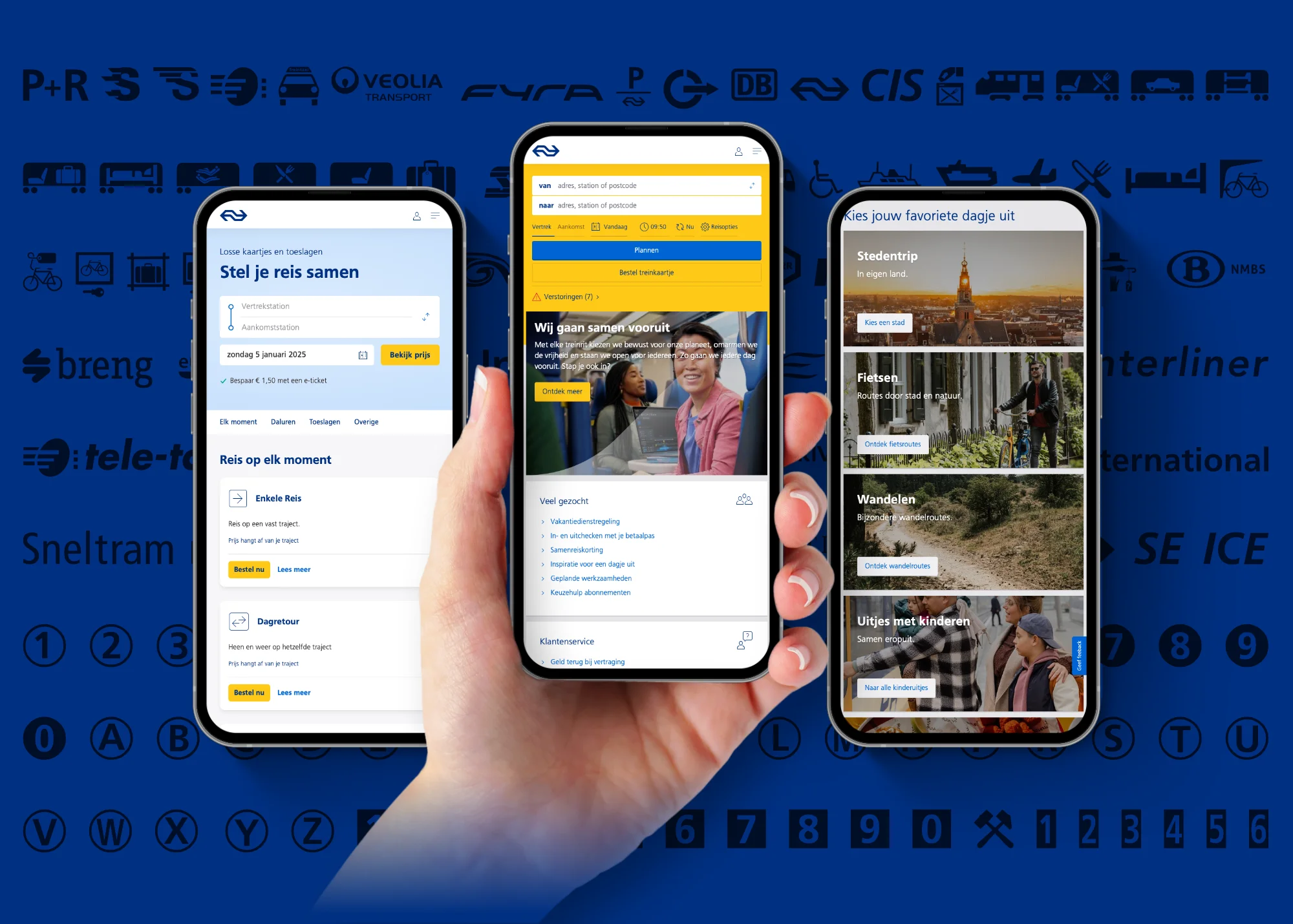
- NS Sans – Regular (400) & DemiBold (600): At the office workplace (personal computer and printer), every NS employee has two NS house style fonts: ‘NS Sans’ and ‘NS Swift’. NS Sans is also used for other digital applications, such as web, mobile devices, screens, information screens at stations or in the train.
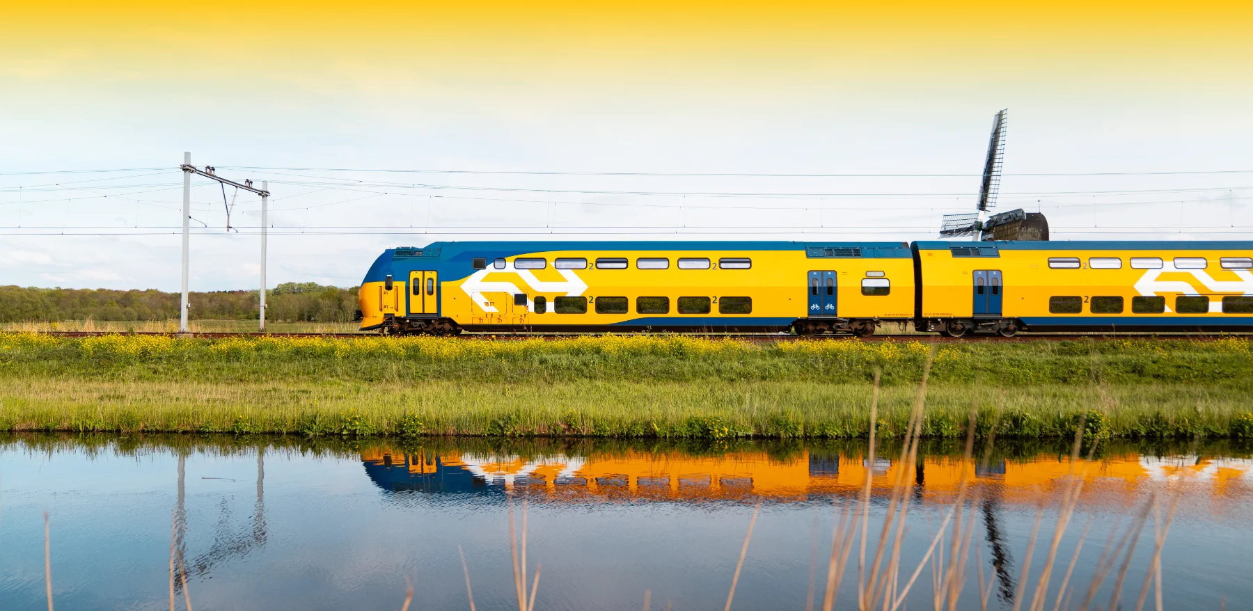
- NS Sign: NS Sign is a font with extra space between the letters. This improves the readability of texts at great distances. This font is used for moving information carriers or for signage of stations and NS buildings, public information signs, lettering of trains and company cars.
- NS Logos: This font contains the most important logos, such as NS and NedTrain.
- NS One & Two: NS One contains 179 functional icons for wagon indications, signage applications such as P+R, WC, bicycle shed, etc. NS Two contains 89 partner logos such as Hermes, Veolia and DB.
- NS Swift: Frutiger and Swift 2.0 are used for printing. This is a serif font.
Disclaimer
All fonts are developed for and licensed to NV Nederlandse Spoorwegen. The NS fonts are not sold externally and are not available for private use. Only selected partners can purchase the fonts for NS applications.
Purpose of the NS fonts update
Visualogik, the long-standing NS font manager, recently retired. He successfully managed the fonts from 1996 to 2020. Since 2020, the fonts have no longer been actively managed. Due to the complexity of software and hardware, it was necessary to update all available fonts to the current technical standard; OpenType. A ‘hygiene factor’, as NS itself calls it.
Update process in 4 steps
Together with NS, we have developed a strategy to update and roll out the fonts step by step. Based on this strategy, we have developed the four-step process below for an efficient and accurate rollout:
1 – Conversion and analysis
First we converted the source files to be able to analyze them. A number of fonts were still made with Fontographer or FontLab from the early 90s. Several font files were even still in the Postscript format that is no longer supported by Adobe.
That was part of the problem, because newer computers can no longer read those fonts, making them unusable and no new NS brand expressions can be created.
2 – Fonts update
We have updated the Font Info of all fonts; written a uniform copyright notice, adjusted the Style Names, Weight & Width Classes to the current standard, updated available OpenType features and correctly spelled out the (by the old software) abbreviated file names. We have also checked the Spacing, Kerning and other parameters of all fonts.
A number of fonts consist of two layers and form a two-colour logo or a composite logo. These shapes must be positioned exactly.
3 – Export
We exported all fonts in the modern OpenType format. This font format can be used universally without any problems, both for Windows and MacOS operating systems.
For the website, we also generated a webfontskit (.WOFF2) that is compact in terms of file size.
With the updated NS Sans web font, we solved an important language problem. In the old font, some Polish characters with accents were displayed incorrectly.
4 – Documentation
Finally, we have set up a new logbook system for the updates. We have created a set of instruction PDFs for the end user. These provide insight into which characters are available for each font and under which keys the icons or logos are located.
For future updates, it is relevant to document the improvements in order to be able to fix any bugs.
Fonts zijn software
Fonts are small software “apps” that need to work together with other software on your computer, such as the operating system, printers, PDF generators, etc. With software, it’s simple: if it’s not updated, it will soon become a problem. Digital media is a living organism. That’s why it’s crucial to make sure that fonts are up to date too.
Creative Director
Added value of the NS fonts update
What is the added value of updating the NS fonts? For the traveller; none. But that was exactly the intention. If the traveller notices a difference, it could possibly cause a crack in the brand experience and we want to prevent that.
For the premium supply partners it is clear; they are technically up to date again and can use the NS fonts for the next 10 years without any problems.
Custom fonts are the real solution
To avoid problems with font updates, we advise you to have your own custom font designed. Custom typography is no longer a niche product. Stoere Binken Design has been designing custom fonts for brand identities and products of SME companies since 2004.
The biggest advantage of our custom fonts is that we design them exclusively for your company and brand. Only you can use them and customers will recognize you by your corporate identity font. An invaluable ambassador for your brand identity that SME companies benefit from.

Your custom font. Your business. Your brand identity
Custom typography is the most powerful part of any brand identity. A handmade font, specially developed for your business, has an extremely high distinctive power. Interested? Request a free quote here.